capital one travel & expenses admin tool
project goals
Reimagine the Travel & Expenses tool for corporate administrators of the Capital One Commercial Credit Card program. Design an easy to use, modern application that is as simple as most consumer solutions.
Activities:
- Understand current and future customers around their corporate credit card program management needs.
- Flesh out all features and deep dive in the Manage Cardholder feature-set.
- Conduct empathy interviews before & during the design process.
- Conduct usability testing with an interactive prototype and make agreed upon changes for final delivery to the development team
understanding the structure
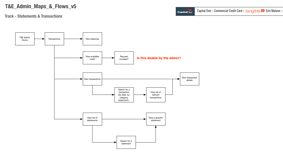
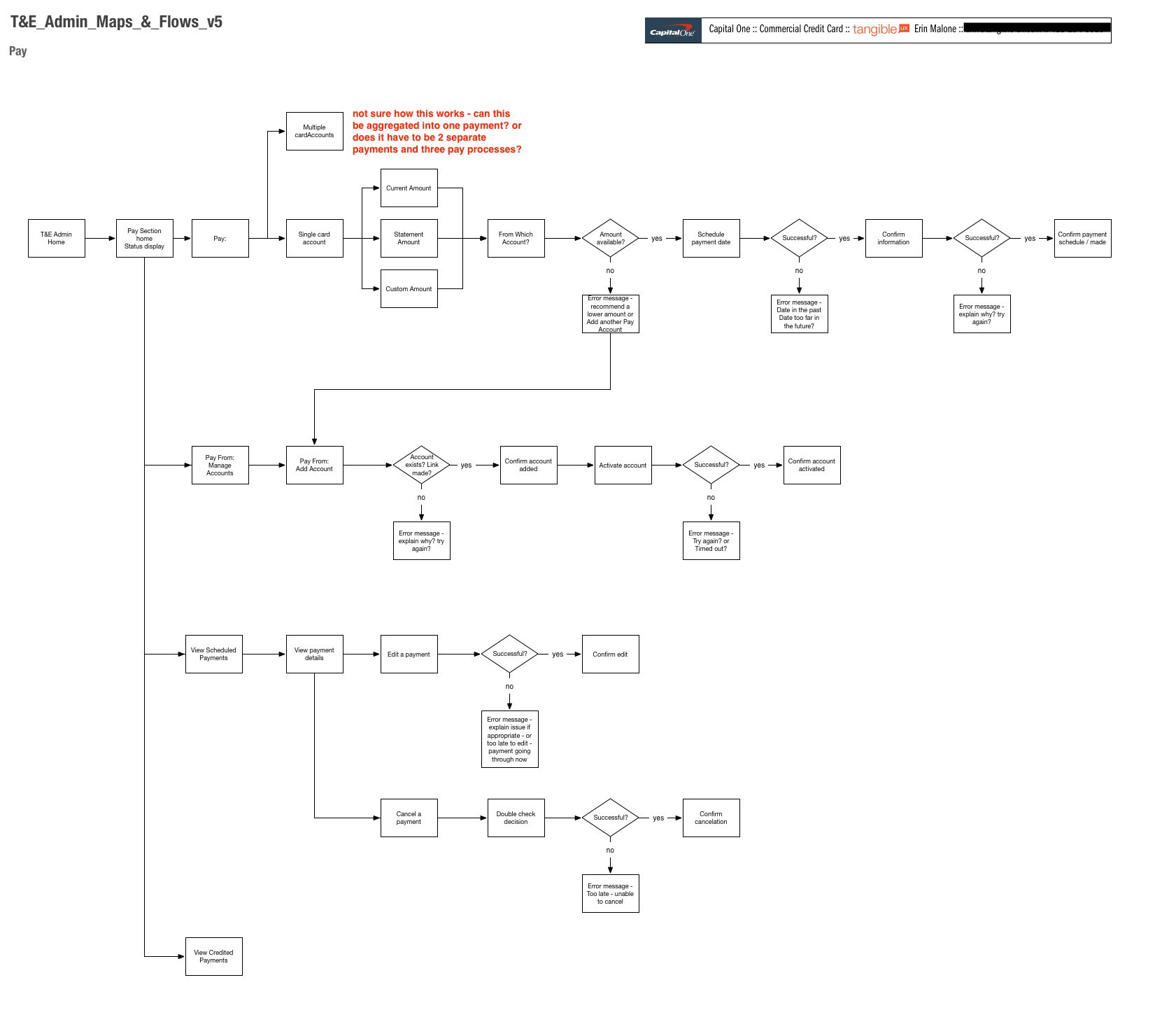
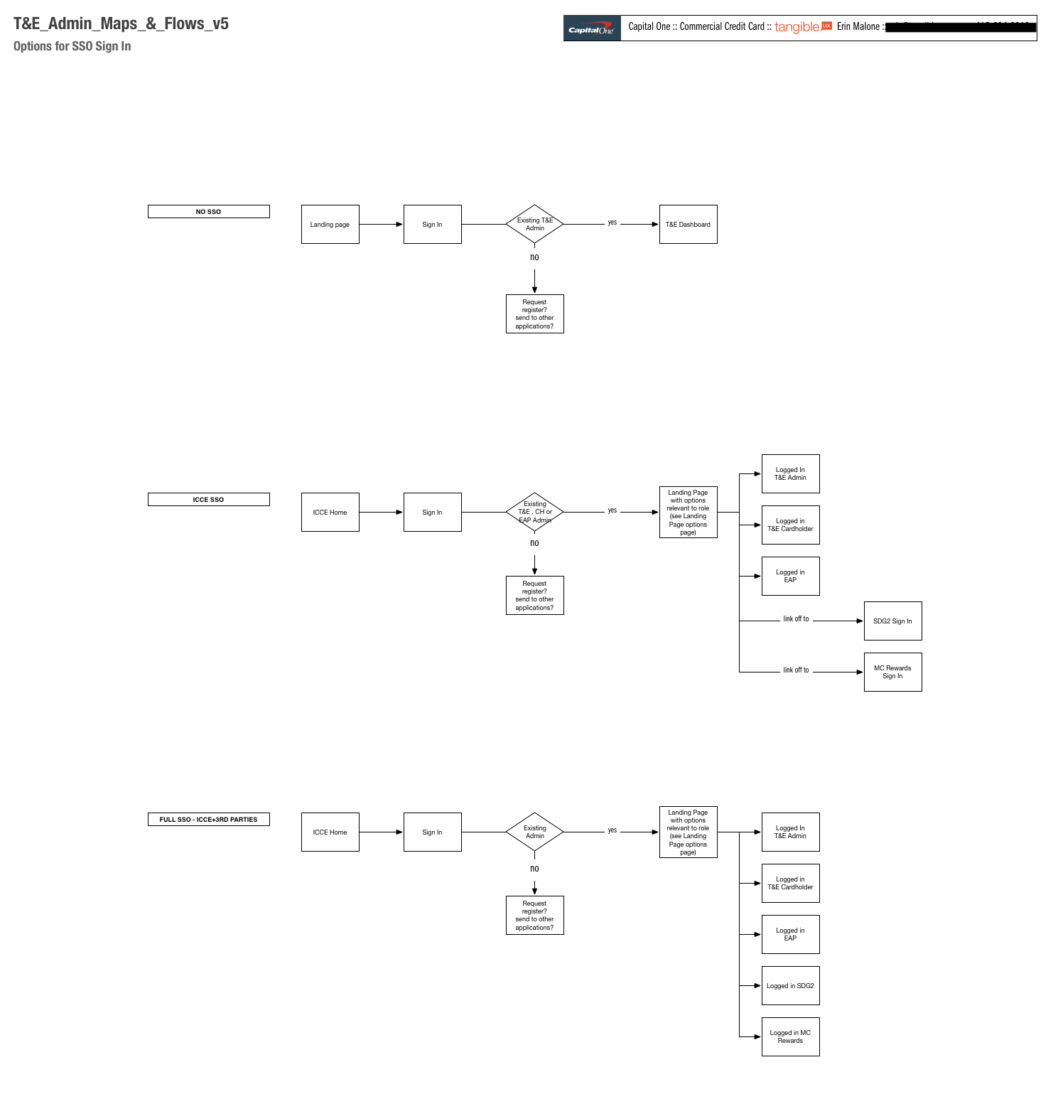
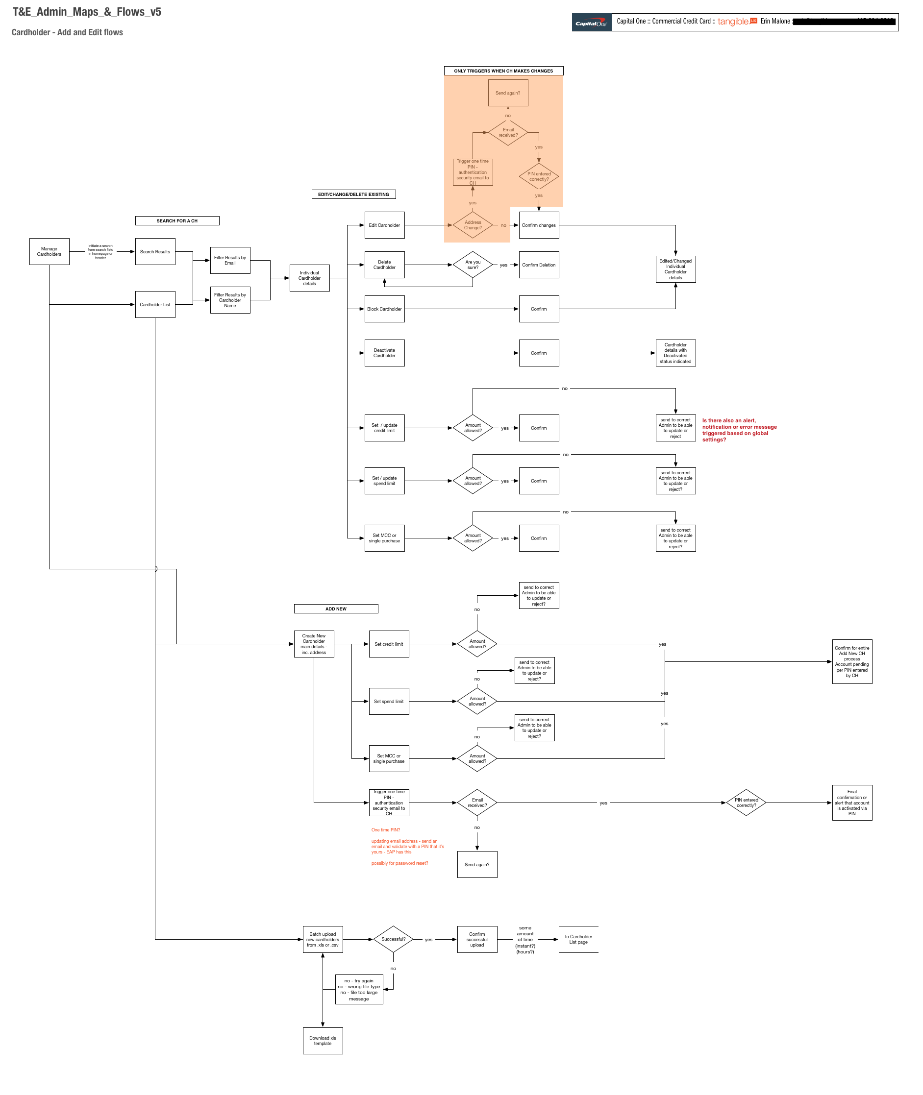
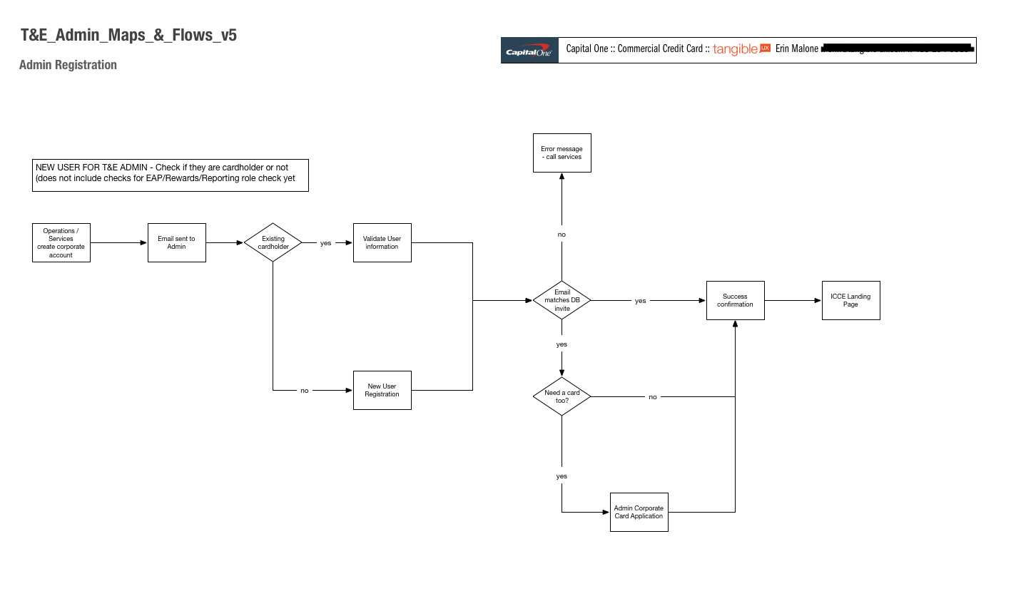
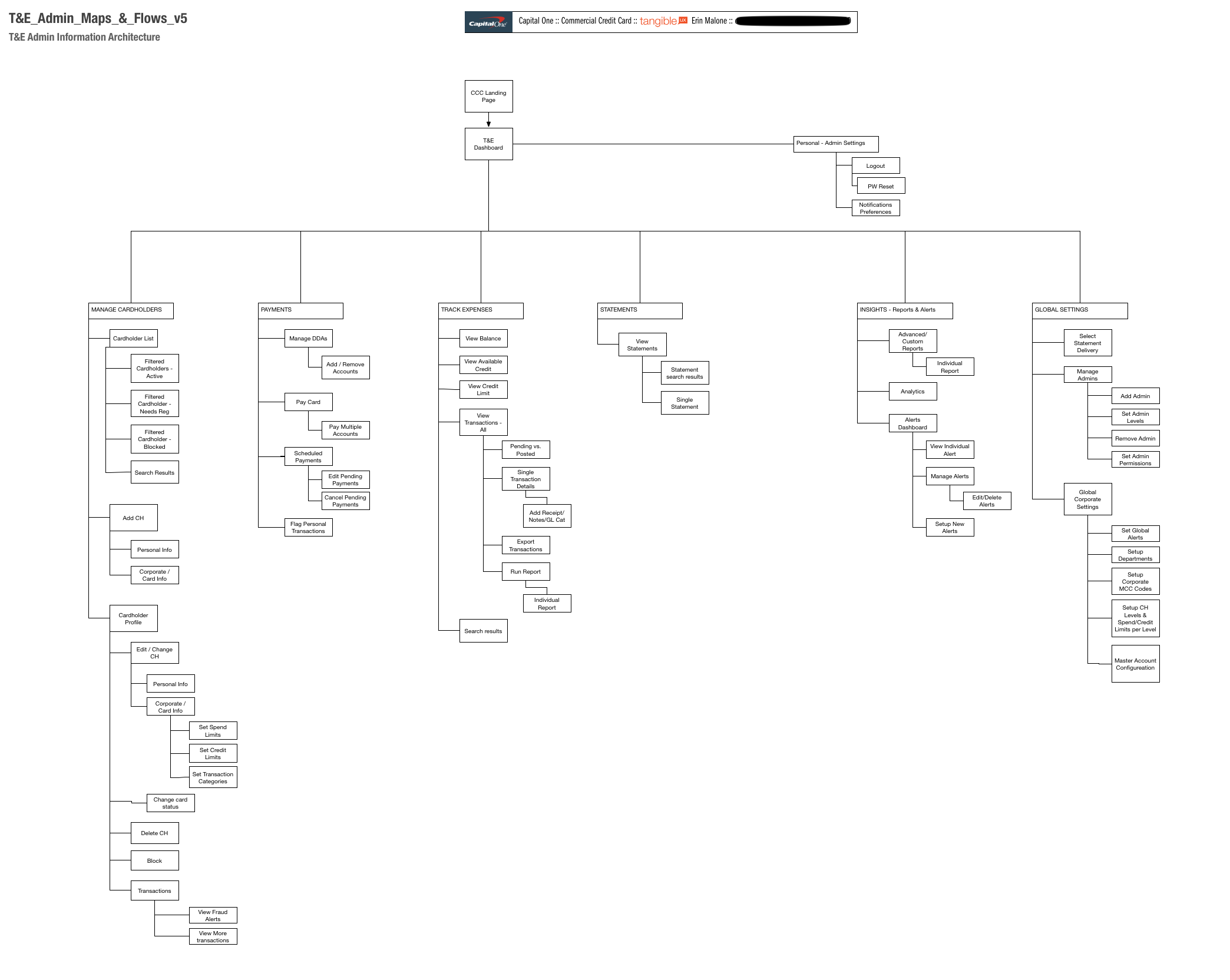
I create the Information Architecture for the entire Travel & Expenses Administrator Tool even though the engagement was focused on the Manage Cardholders section only.
Fleshing out the information architecture for the entire application allows us to understand the relationships between different areas of the application and dependencies to be aware of when building the different sections.
The IA gives the team a map for building out the future sections of the tool.
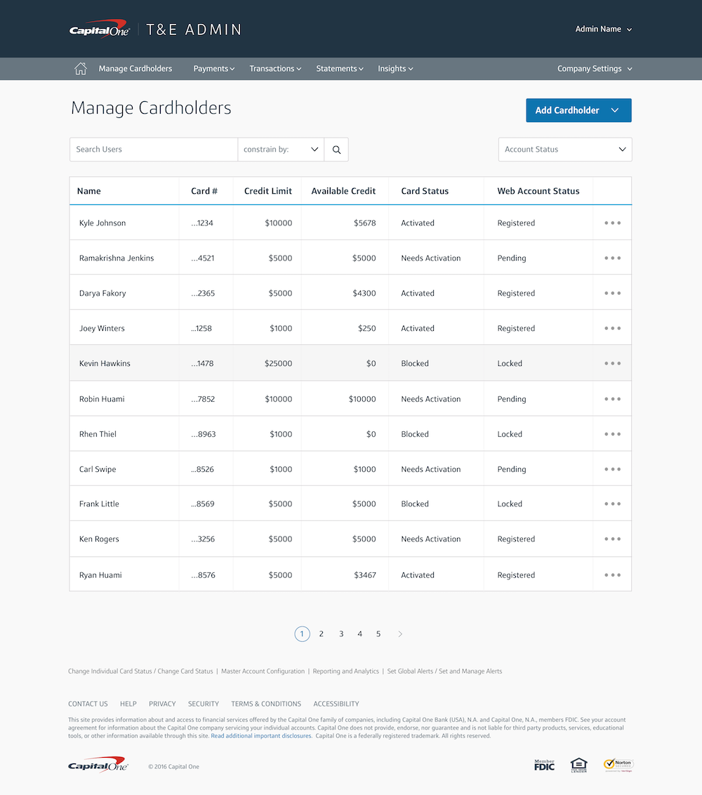
screen designs - hi-fidelity wireframes
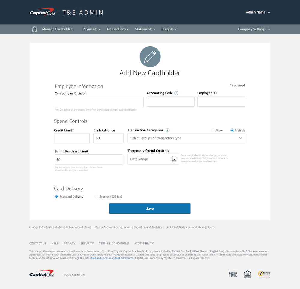
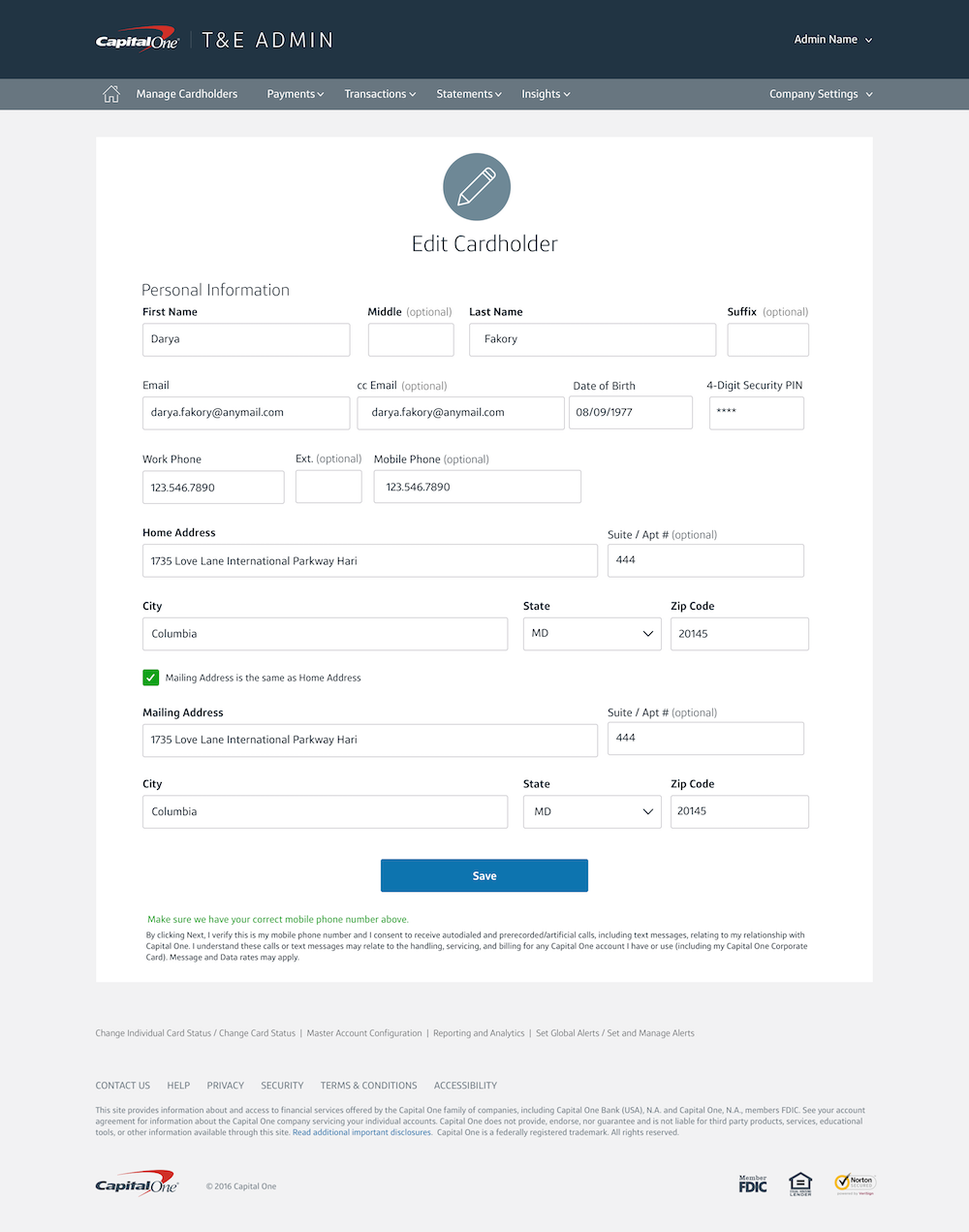
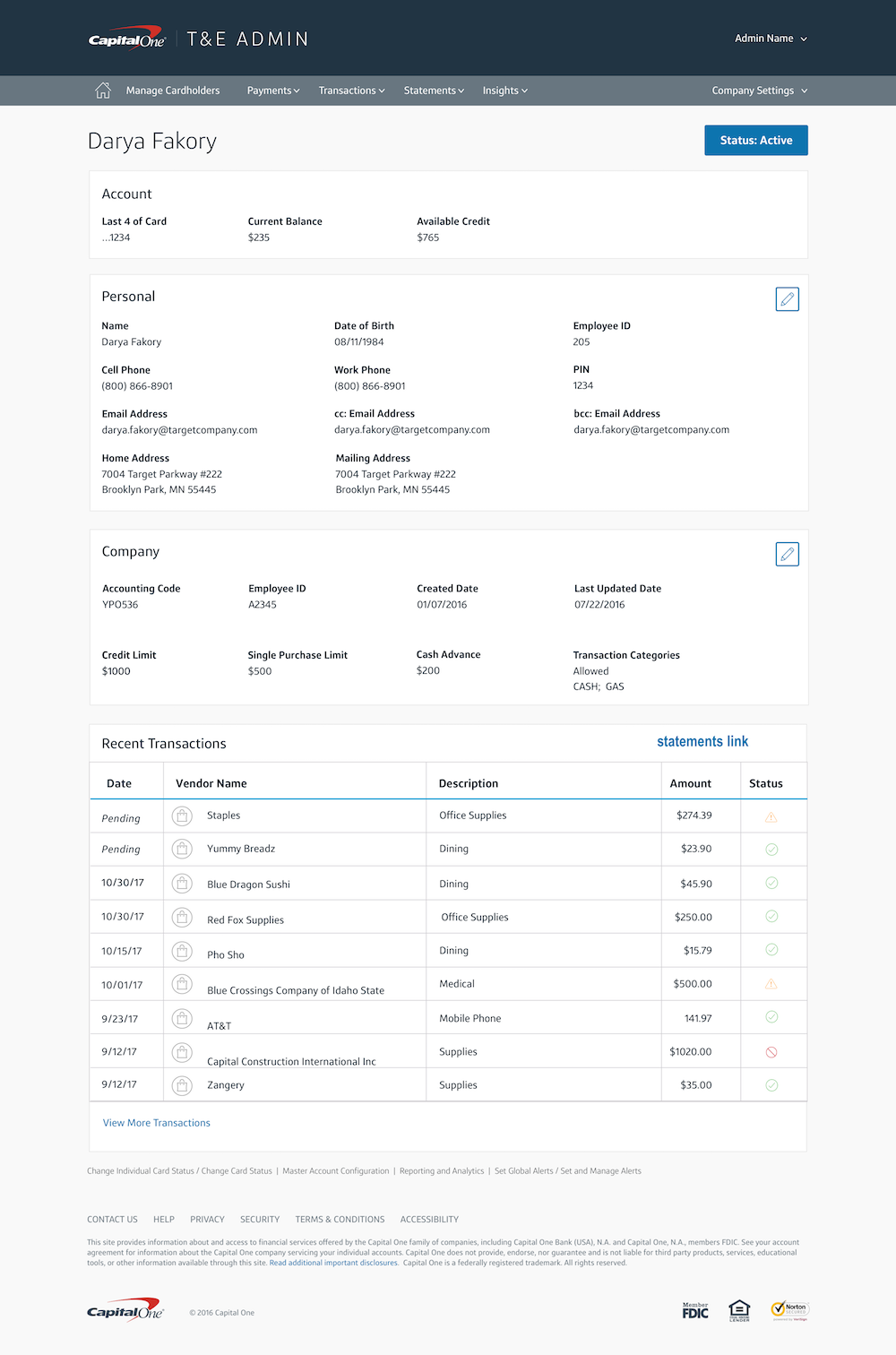
Using the existing Capital One design system, I created screen mockups for user testing for each screen in the system.
This specific project was constrained to the Manage Cardholders section of the application and all its related screens.
We used the mock-ups to create an interactive prototype in Invision for user testing, iterating and fixing things after every two sessions. The end result was a tight prototype for reference by the development team.
results
The Manage Cardholders - which included dynamic searching and edit features, launched in February 2018 and is part of the tools sold to large corporate entities as part of their Commercial Credit Card Travel & Expenses suite of offerings.
team makeup
1 interaction designer - me
1 project lead - me
1 client product manager
1 client business analyst
This was a Tangible UX project.
Selected Work
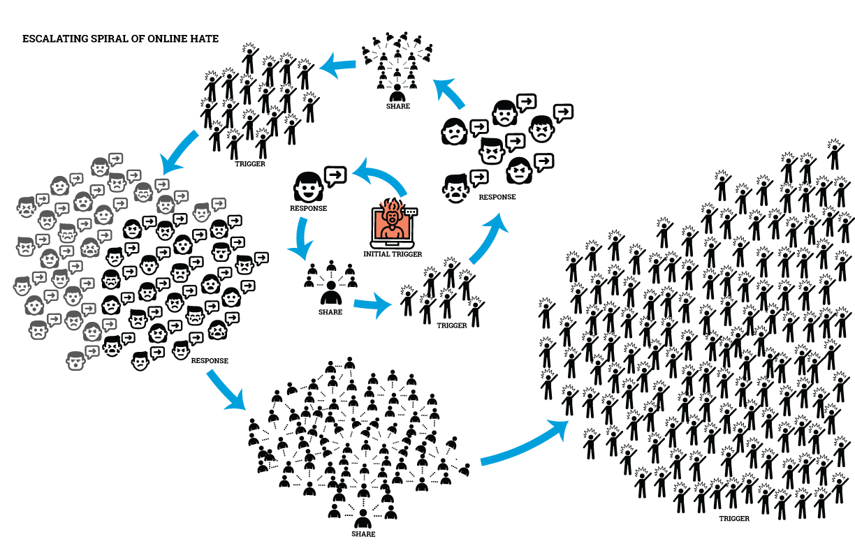
Social Pattern Library for ADLInteraction Design Research and Writing
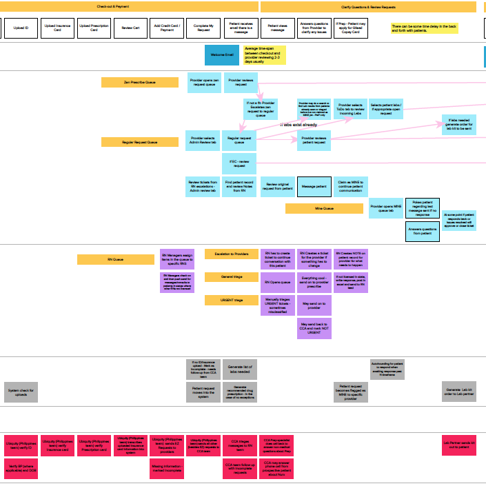
nurxservice design, ethnography, interaction design
neptune financial lending appinteraction design
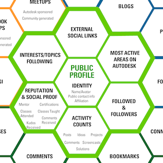
autodesk university social strategymodeling, strategy
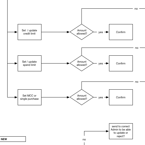
capital one t&e programinteraction design, user research
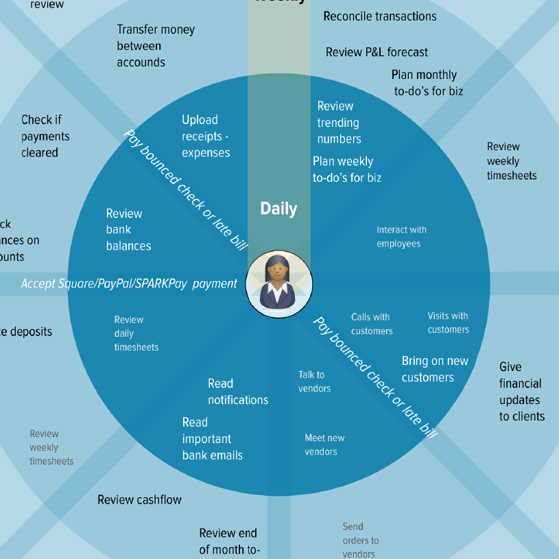
capital one small business banking concept models & IAstrategy, information architecture

katnipbrand design, interaction design
find me elsewhere:
photography: erinmalone.com
medium
letterpress: 8 paw press
twitter
mastodon
New mini guides available over on Gumroad for the UX Designer:
Mini Guide to Color
Mini Guide to Maps & Models
Mini Guide on Gestalt Principles
Mini Guide to Using Grids

